
Thursday, 29 March 2012
Monday, 26 March 2012
Friday, 23 March 2012
Thursday, 22 March 2012
Tuesday, 20 March 2012
Monday, 19 March 2012
Friday, 16 March 2012
Dolby
Try and have a more complex layout to your contents page- go back to some real media artefacts and look at how you could have sections rather than two coloumns as this makes it look rather 'blocky'.
Tuesday, 13 March 2012
Double Page Spread Second Draft
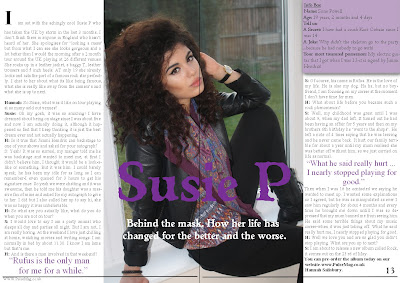
This is the second draft of my double page spread. I changed the layout so the picture and heading were in the centre and the article written around it. I still included the info box and pull quotes to make the article look more interesting. The line at the bottom of the page makes it clear it has fined and allows me to easily put a page number and website.
Contents Page Third Draft

This is my third draft of my contents page. I changed the masthead and page numbers colour slightly to match the change I made to the front cover. I also changed one of the articles to be about Mick Jagger. If I have articles about celebrities it makes my magazine seem more established, it aslo helped fill my front cover.
Front Cover Third Draft
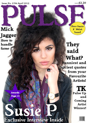
In this draft I slightly darkened the colour of 'PULSE' and the pug because I wanted to make them seem more suited to the genre. I also added another article heading to fill up the space and make it look like the magazine has a lot to offer and the reader wouldn't get bored. This meant I then had to move the price again but that isn't that critical as it is rather small.
Straker
the image on the front cover (second draft) is good. the cover is a bit empty though, there's not enough text to attract the buyer. You might want to consider adding to it
Front Cover Second Draft
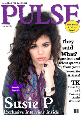
This is my second draft of my front cover, I changed the photograph so it was more suited to the rock and roll genre and less 'girly'. This meant I then had to alter the text a font a bit to make it clear to read. I placed the article headings around her head so all the focus is on her face. I also moved the price as I wanted it to be clearer, plus it also helps fill a blank space.
Monday, 12 March 2012
Double Page First Draft
 This is the first draft of my double page spread. I wanted to have the image very big so I filled the whole page with it, but I also added an 'Artist info box' so the reader feels they know her even more. I wrote Susie P in the same colour and font as on the title on the front cover so it keeps the house style. It is very big so it catches the readers eye and makes it clear who it is about. I included pull qotes in purple to keep the house style and engage the reader before they have even started reading it. The article is clear to read because it is in traditional article style of three columns and paragraphs.
Contents Page Second Draft
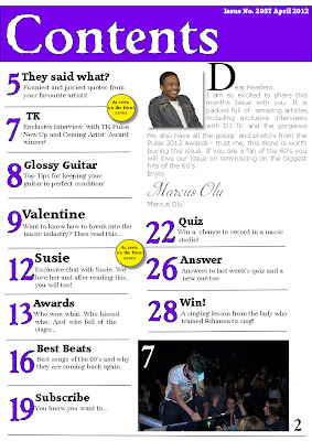
This is my second draft of my contents page. I changed the faont on the front cover so therefore I changed the font title on this page to so there is a clear house style throughout my magazine. I made the article headings and page numbers smaller a they didn't need to be so big and they were taking up a lot of the page. I also added an editor's letter to make it look more realistic; I included a picture of the editor so they reader would know who he is and be more likely to read the letter. I made the first letter of the editors letter very large so it stands out and makes it clear where the letter starts. Also I replaced my small pictures of various artists who are not related to my articles for one larger photo that is from a specific article. The photo is of a DJ in a club so it clearly shows he is a musician and the people around him show that he is popular already which would make people want to read about him. On the photo I put the page number it is related to so if the reader is intriged they can go straight to that page. Finally I put the actual page number at the bottom of the page as I will have this on every page of my magazine in the house font-Weathered SF.
Friday, 9 March 2012
Front Cover First Draft
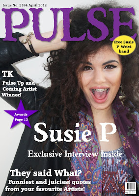
This is my first draft of my front cover, I changed my font as it was a lot easier to work with and I liked the style of the font. I chose a medium close up of Susie as I wanted the audience to see her face, also she is looking at the camera and is very happy which is a good look for the front cover. I placed the writing around her and put in a couple of pugs to make it brighter and catch people's attention.
dolby
Well done for getting drafts up on here. I would say that there are a few things to work on; the font is rather large and the pictures are all clumped and I'm not sure it works- they are very different images and don't relate to each other.
Thursday, 8 March 2012
Tuesday, 6 March 2012
Possible Images
Monday, 5 March 2012
Straker
Get constructing now. I think you're really well prepared . I appreciate that you have several choices of lay out and you'll go with what works, just don't get bogged down with trying to incorporated too many of your ideas.
Contents Page Layout

This is a fairly simple layout, in all of these i have the masthead at the top making it cear that it is the contents page. I will also have the issue number and date at the top as they are important butthey will be quite small. I also always have the page number at the bottom as this always needs to be clear. The whole page will be filled with a large numbers and then a description of the articles on these pages and what they are about. They will be divided into section such as: regular, feature and ones on the front cover.
The photographs will be at the top of the page, possible numbered to show which article they belong too.
The next layout is very much the same, however the photo's will be in the middle of the page and the article will be written around them. Also I will include the website at the bottom of the page.
Friday, 2 March 2012
Double Page Spread Layout
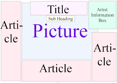
My first layout is fairly simple, the main focus should be the picture so this will be fairly big and in the middle of the page. The title will also be rather big so when the reader turns the page they will see the title and the subheading will explain what the article is about so it will engage the reader. I decided to include a 'Artist infomation box' will will give infomation about the person in my photograph; this will make the reader feel they know the artist better. The article will be written all around the page and picture but it needs to be easy to follow. 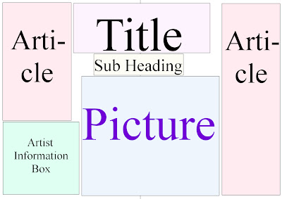
My second layout is fairly similar however the article will only be written on the left and right hand of the page. The title and sub heading will still be a main focus. Also the infomation box will be at the bottom so it isn't as noticable. The picture is also slightly smaller.

My final layout is fairly different. The photograph takes up the whole of a page so it is nice and big. The title is still fairly big but it is on the left hand page. The article is all on one page so it is fairly together and it is easy to follow. Although this layout doesn't include an artist infomation box.

My second layout is fairly similar however the article will only be written on the left and right hand of the page. The title and sub heading will still be a main focus. Also the infomation box will be at the bottom so it isn't as noticable. The picture is also slightly smaller.

My final layout is fairly different. The photograph takes up the whole of a page so it is nice and big. The title is still fairly big but it is on the left hand page. The article is all on one page so it is fairly together and it is easy to follow. Although this layout doesn't include an artist infomation box.
Front Cover Layout
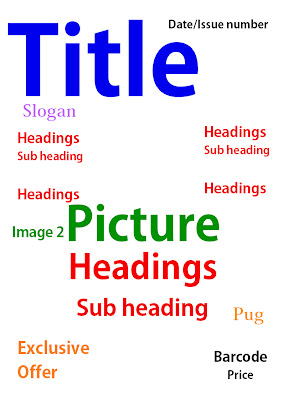
My first front cover is fairly simple, the title is the most important thing as people need to know what magazine it is so that is very large and in the top left hand corner. The date and issue number are also important but they don't need to catch the readers attention, so I put them in the top right hand corner. I put a sloagn under the title to explain what it means. I want the picture to take up the whole page so i put that in the centre and I will have the less important headings on either side of it. Then I will have the main heading that relates to the main photo on top of it in the centre. There will also be a smaller photograph relating to another heading. I will have the exclusive offer lower down but quite big and bright to catch people's attention. The pug will be next to the heading so they will read it after they have read the main heading. Finally I will have the barcode and price in the corner as they aren't important.

My second front cover is fairly similar but I think it is more sophisticated. The differences are: I will have the headings all on one side and the photograph more to the right, then the headings will be placed around the photo to make it look more sophisticated and easy to follow, it will also draw the readers eye to the photo. Also the pug will be at the top, next to the title so its easy to see and the exclusive offer will have a photograph next to it to explain it more.
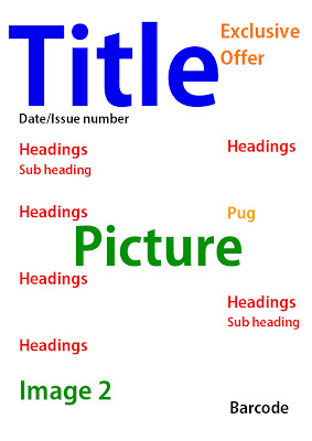
My final is more simplistic; the exclusive offer will be near the top so it is easier to see and encourage people to buy the magazine. The headings will be on both side of the photo to frame it. Also I will have a second image at the bottom so it doesn't clash with the first photo.
I think the laout that I will try to use is the second one as it looks the most sophisticated.
Subscribe to:
Comments (Atom)


