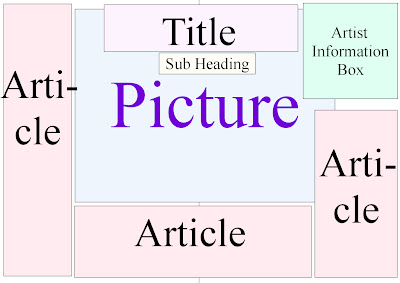
My first layout is fairly simple, the main focus should be the picture so this will be fairly big and in the middle of the page. The title will also be rather big so when the reader turns the page they will see the title and the subheading will explain what the article is about so it will engage the reader. I decided to include a 'Artist infomation box' will will give infomation about the person in my photograph; this will make the reader feel they know the artist better. The article will be written all around the page and picture but it needs to be easy to follow. 
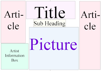
My second layout is fairly similar however the article will only be written on the left and right hand of the page. The title and sub heading will still be a main focus. Also the infomation box will be at the bottom so it isn't as noticable. The picture is also slightly smaller.

My final layout is fairly different. The photograph takes up the whole of a page so it is nice and big. The title is still fairly big but it is on the left hand page. The article is all on one page so it is fairly together and it is easy to follow. Although this layout doesn't include an artist infomation box.

My second layout is fairly similar however the article will only be written on the left and right hand of the page. The title and sub heading will still be a main focus. Also the infomation box will be at the bottom so it isn't as noticable. The picture is also slightly smaller.

My final layout is fairly different. The photograph takes up the whole of a page so it is nice and big. The title is still fairly big but it is on the left hand page. The article is all on one page so it is fairly together and it is easy to follow. Although this layout doesn't include an artist infomation box.
No comments:
Post a Comment