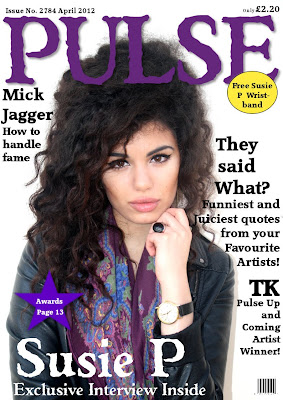
In this draft I slightly darkened the colour of 'PULSE' and the pug because I wanted to make them seem more suited to the genre. I also added another article heading to fill up the space and make it look like the magazine has a lot to offer and the reader wouldn't get bored. This meant I then had to move the price again but that isn't that critical as it is rather small.
No comments:
Post a Comment