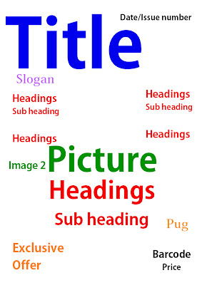
My first front cover is fairly simple, the title is the most important thing as people need to know what magazine it is so that is very large and in the top left hand corner. The date and issue number are also important but they don't need to catch the readers attention, so I put them in the top right hand corner. I put a sloagn under the title to explain what it means. I want the picture to take up the whole page so i put that in the centre and I will have the less important headings on either side of it. Then I will have the main heading that relates to the main photo on top of it in the centre. There will also be a smaller photograph relating to another heading. I will have the exclusive offer lower down but quite big and bright to catch people's attention. The pug will be next to the heading so they will read it after they have read the main heading. Finally I will have the barcode and price in the corner as they aren't important.

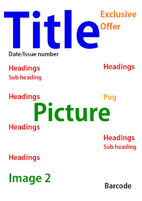
My second front cover is fairly similar but I think it is more sophisticated. The differences are: I will have the headings all on one side and the photograph more to the right, then the headings will be placed around the photo to make it look more sophisticated and easy to follow, it will also draw the readers eye to the photo. Also the pug will be at the top, next to the title so its easy to see and the exclusive offer will have a photograph next to it to explain it more.

My final is more simplistic; the exclusive offer will be near the top so it is easier to see and encourage people to buy the magazine. The headings will be on both side of the photo to frame it. Also I will have a second image at the bottom so it doesn't clash with the first photo.
I think the laout that I will try to use is the second one as it looks the most sophisticated.
No comments:
Post a Comment