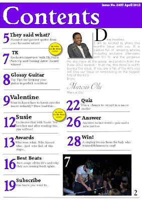
This is my second draft of my contents page. I changed the faont on the front cover so therefore I changed the font title on this page to so there is a clear house style throughout my magazine. I made the article headings and page numbers smaller a they didn't need to be so big and they were taking up a lot of the page. I also added an editor's letter to make it look more realistic; I included a picture of the editor so they reader would know who he is and be more likely to read the letter. I made the first letter of the editors letter very large so it stands out and makes it clear where the letter starts. Also I replaced my small pictures of various artists who are not related to my articles for one larger photo that is from a specific article. The photo is of a DJ in a club so it clearly shows he is a musician and the people around him show that he is popular already which would make people want to read about him. On the photo I put the page number it is related to so if the reader is intriged they can go straight to that page. Finally I put the actual page number at the bottom of the page as I will have this on every page of my magazine in the house font-Weathered SF.
No comments:
Post a Comment