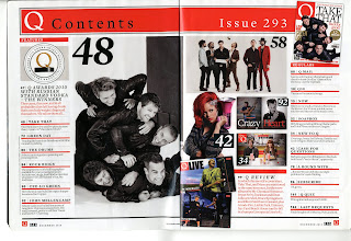
 Q magazine contents page:
At the top of this contents page is a big red bar – which fits the house style of red, black and white. These colours are very simple but also bold; they are also related to the rock genre as red connotates passion; and black connotates darkness and danger however white connotates purity which balances them all out. In this bar, on the left hand side is the Q logo that was on the fron cover, although it is uch smaller-this is used throughout the magazine so on every page the reader is reminded of what magazine they are reading. Then they have “Contents” so it is clear what the page is for and if the reader wants to find a certain article they can go to the contents page which they know will be at the front. Then on the right hand side it says “Issue 293” this shows the reader that there have been lots of issues so it must be a well established magazine. All the writing in this bar is very big with a simple font so it is easy to read. Next to this is a photograph of the front cover-this is so the reader can relate the issue number to the actual issue.
Underneath this on the left hand side is another red bar-although this one is much smaller-which says “FEATURES” It is in block capitals and again a simple font so it is easy to read, and it is white so it stands out against the red bar. It makes it clear that below it is listing all the feature articles and what page they are on. Below this is a picture of a Q shaped trophy saying award winners-this relates to the writing below which says that the article about the Q award winners are on page 47. Then is red it has a short description of what the article is about. This is clearly a very important article because t is slightly different to the others. It still has the page number then a little line and he article title however the writing is bigger than the others. Also it has a long title whereas the other articles are summed p in one or two words. Also the description is in red whereas it is black for the others but they are divided by red lines, this is divided by a black line. This happens again in the same format with the review on page 99; this is shown in the bottom right corner, so these were clearly chosen by the magazine as the most important articles.
On the left hand side of the second page are the “REGULARS” they are written in the same style as the features with the age number, title and description. All the writing is aligned to the left; however the bars under each page number create the equal column size. Not every page is mentioned in the contents page but all the important articles are divided into regulars and features and then put in number order again so it is easier to follow. At the bottom of the page is a big black line to show that it is finished, the only things underneath this are the information that is placed on the same page in every page-the Q logo, the page number and date.
Finally in the middle of the page are photographs which are related to the articles. There are seven photographs altogether. For example the biggest photograph is of take that with each photograph is a large number which tells the reader which page is the article-which is related to that picture- is on.
No comments:
Post a Comment