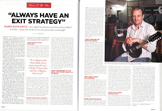
 Word magazine double page spread analysis:
 The Word magazine double page spread sticks with the same colour scheme as in the front cover and the contents page; these colours are red, black and white. These colours are very simple but also bold; they are also related to the rock genre as red connotates passion, blood and sex; and black connotates darkness and danger however white connotates purity which balances them all out. The whole layout of this double page is very clear and easy to follow.
At the top of the page is a thin black line, which is used throughout Word magazine to separate different articles, so this line shows us that this is a new section-there are also lines separating each column and at the end of the text so it is very clear to read. In the middle of this line is a red box (fits with the colour scheme) with “Word To The Wise” written inside it. This is important because it partially explains what the article will be about but it also begins with “Word” which is the title of the magazine so it will remind readers of the magazine they are reading and they will then relate that article to this magazine. Also it suggests that in this article the writer is giving the reader useful advice. The font for this writing is Handscript SF which is very elegant and sophisticated-this tells the reader that it isn’t like advice from other magazines as they tend to be for younger audiences however the target audience for Word magazine is older and more refined.
Underneath this is the main title of this article-“ALWAYS HAVE AN EXIT STRATEGY” this is in the centre of the page in big bold black writing so it is clear to see. It stands out in the page so the reader knows that this is the title of the article-it is also a quote from the article so it engages the reader and makes them want to read on. It is a plain font (possible Arial Bold) as it doesn’t need to be fussy it just needs to stand out as they want you to read the words rather than the font also because of tis reason it is all in block capitals.
Below the title is “Mark Radcliffe” this is again clear and bold but it isn’t quite as big because it isn’t so important, however it is quite important information that the reader needs to know so it is red to catch the reader’s eye. Then there is a sort description of him as if the reader knows who wrote the article they are more likely to engage and enjoy the article. For this reason also in the top right hand corner there is a large picture of Radcliffe. This takes up about 1/3 of the page so the reader cannot miss it. In the picture it shows him holding a guitar-this relates him to the rock genre of the magazine. In the background is a sign for BBC Radio so the reader relates him to this and knows what he does even if they didn’t read the description.
Back to the beginning of the article, under Radcliffe’s description is “Interview by Mark Ellen” however this is very small so if somebody wants to know who has written it they can find out, but if they aren’t looking for it, it will not necessarily catch their eye. Finally underneath this it goes on to the actual article. There are three columns on each page which are separated by thin lines. There are seven paragraph titles’s which are in bold and red-these are also quotes from the text and encourage the reader to read on. The font of the text is very simple as it has to be clear to read and not be too fussy. There is also a pull quote in the middle of the first page-this will probably be read by the reader before they start reading the article so must engage them-this is also in red to catch the reader’s eye. Finally at the bottom of the page is the page number and name of the magazine which is used throughout Word so the reader know what they are reading and can easily find things.
No comments:
Post a Comment