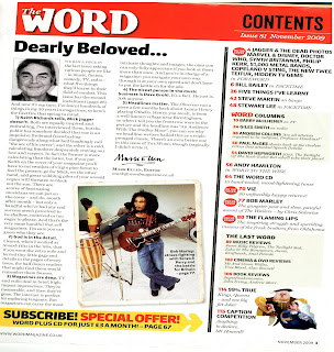
 The Word Contents Page:
The contents page of Word magazine has a bright red mast head which says the name of the magazine, that it is a contents page, the issue number and the date. On the front cover the title-The Word- is in bold with a white outline and red on the inside, however on this page it is smaller so it doesn’t need to be so detailed; the masthead background is red-this relates it to the original display but the whiting is pure white. This makes it easier to read because as it is smaller, if it was to detailed then it may look cluttered and jumbled but it still uses the same font and layout as that is classic to Word magazine and the audience would relate that layout to the magazine. The word ‘Contents’ is in block capitals and also a fairly basic font so it is easy and clear to read.
It is in black, this means he top of the page uses the colours: black, red and white-which is the colour scheme of the magazine as the connotates rock and roll which is the magazines genre. The issue number and date are in a much smaller font size as they are not that important, and also another font for that matter. The font is far more elegant and far less ‘in your face’ in addition they are in white so they seem softer and easier to read against the red background. There is a line between the issue number, date and the word ‘Contents’ this separates the important information and the extra information.
Underneath this is details on what articles are in the magazine and on what page they are on, that is on the right hand side of the page. Then on the other side of the page is a letter from the editor. The letter from the editor takes up most of the page as it is interesting and lots of people want to read it, however the contents is normally only looked at when people want to find a certain page. The first line of the editor’s letter –“Dearly beloved…” is n very big font, this is because it makes it clear that it is a letter as it is a standard opening line of a letter. The font is the same as the headings of articles on the front cover; this would be a similarity throughout the magazine. Next, is a photo of the editor (Mark Ellen) this makes the letter more personal because the audience can see what he looks like and know who wrote the letter. The photo is in black and white so it fits in with the colour scheme, in addition it makes him seem more friendly and down to earth because it would remind the audience of an old family photo.
In the letter Ellen makes 5 main points so these are numbered and in bold so it makes it clear what he is saying, it also means that if you don’t want to read the whole latter you can just read the main points and understand what he is trying to say. Finally at the end of the letter he has signed it-which again makes it seem more personal, then his email address is underneath it, this makes readers feel that they can contact him and he is interested in their opinions. The email address is also at the bottom of the page, along with the date and page number; these are on most pages of the magazine. Also at the bottom of the page is a bright yellow pug, s it is very eye catching. This pug is encouraging people to subscribe to the magazine-which is what the magazine want you to do as their main purpose is to sell magazines. It offers a free CD and a lower price per issue to attract people to subscribing.
Then the page is divided by a thick black line, to make it clear that part is something completely different. Then there are the main article headings with the page number next to it, this is in red to make it stand out so the reader doesn’t have to go searching for it. Also in red are signs which say which are the articles that were mentioned on the front cover-as these are usually the articles the audience most want to read. In beige coloured boxes are the articles that are regular features-as often people who buy the magazine every week will like that they are always there and want to read them.
There are two of these boxes – the ‘Word columns’ and the ‘Last Word’-which is a play on the magazines title. At the bottom of this column is a comical cartoon of some previous monarchs this will interest readers and make them want to know which article they are related to.
There is also a old photograph of Bob Marley as there is an article about him, this means that even if people don’t read the contents page, if they just glance at it they will still know that there is an article about him in the magazine.
No comments:
Post a Comment