Monday, 23 April 2012
Thursday, 29 March 2012
Monday, 26 March 2012
Friday, 23 March 2012
Thursday, 22 March 2012
Tuesday, 20 March 2012
Monday, 19 March 2012
Friday, 16 March 2012
Dolby
Try and have a more complex layout to your contents page- go back to some real media artefacts and look at how you could have sections rather than two coloumns as this makes it look rather 'blocky'.
Tuesday, 13 March 2012
Double Page Spread Second Draft
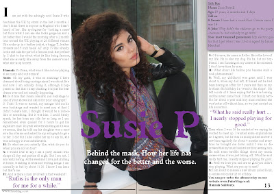
This is the second draft of my double page spread. I changed the layout so the picture and heading were in the centre and the article written around it. I still included the info box and pull quotes to make the article look more interesting. The line at the bottom of the page makes it clear it has fined and allows me to easily put a page number and website.
Contents Page Third Draft

This is my third draft of my contents page. I changed the masthead and page numbers colour slightly to match the change I made to the front cover. I also changed one of the articles to be about Mick Jagger. If I have articles about celebrities it makes my magazine seem more established, it aslo helped fill my front cover.
Front Cover Third Draft
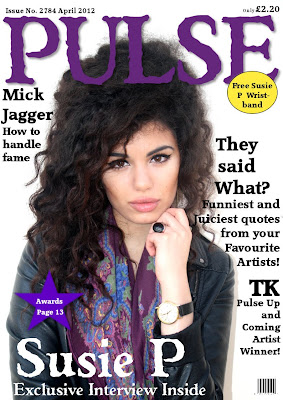
In this draft I slightly darkened the colour of 'PULSE' and the pug because I wanted to make them seem more suited to the genre. I also added another article heading to fill up the space and make it look like the magazine has a lot to offer and the reader wouldn't get bored. This meant I then had to move the price again but that isn't that critical as it is rather small.
Straker
the image on the front cover (second draft) is good. the cover is a bit empty though, there's not enough text to attract the buyer. You might want to consider adding to it
Front Cover Second Draft
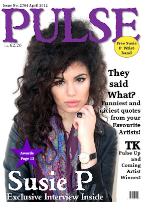
This is my second draft of my front cover, I changed the photograph so it was more suited to the rock and roll genre and less 'girly'. This meant I then had to alter the text a font a bit to make it clear to read. I placed the article headings around her head so all the focus is on her face. I also moved the price as I wanted it to be clearer, plus it also helps fill a blank space.
Monday, 12 March 2012
Double Page First Draft
 This is the first draft of my double page spread. I wanted to have the image very big so I filled the whole page with it, but I also added an 'Artist info box' so the reader feels they know her even more. I wrote Susie P in the same colour and font as on the title on the front cover so it keeps the house style. It is very big so it catches the readers eye and makes it clear who it is about. I included pull qotes in purple to keep the house style and engage the reader before they have even started reading it. The article is clear to read because it is in traditional article style of three columns and paragraphs.
Contents Page Second Draft
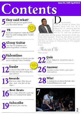
This is my second draft of my contents page. I changed the faont on the front cover so therefore I changed the font title on this page to so there is a clear house style throughout my magazine. I made the article headings and page numbers smaller a they didn't need to be so big and they were taking up a lot of the page. I also added an editor's letter to make it look more realistic; I included a picture of the editor so they reader would know who he is and be more likely to read the letter. I made the first letter of the editors letter very large so it stands out and makes it clear where the letter starts. Also I replaced my small pictures of various artists who are not related to my articles for one larger photo that is from a specific article. The photo is of a DJ in a club so it clearly shows he is a musician and the people around him show that he is popular already which would make people want to read about him. On the photo I put the page number it is related to so if the reader is intriged they can go straight to that page. Finally I put the actual page number at the bottom of the page as I will have this on every page of my magazine in the house font-Weathered SF.
Friday, 9 March 2012
Front Cover First Draft
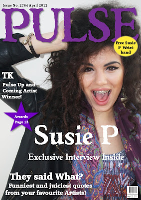
This is my first draft of my front cover, I changed my font as it was a lot easier to work with and I liked the style of the font. I chose a medium close up of Susie as I wanted the audience to see her face, also she is looking at the camera and is very happy which is a good look for the front cover. I placed the writing around her and put in a couple of pugs to make it brighter and catch people's attention.
dolby
Well done for getting drafts up on here. I would say that there are a few things to work on; the font is rather large and the pictures are all clumped and I'm not sure it works- they are very different images and don't relate to each other.
Thursday, 8 March 2012
Tuesday, 6 March 2012
Possible Images
Monday, 5 March 2012
Straker
Get constructing now. I think you're really well prepared . I appreciate that you have several choices of lay out and you'll go with what works, just don't get bogged down with trying to incorporated too many of your ideas.
Contents Page Layout

This is a fairly simple layout, in all of these i have the masthead at the top making it cear that it is the contents page. I will also have the issue number and date at the top as they are important butthey will be quite small. I also always have the page number at the bottom as this always needs to be clear. The whole page will be filled with a large numbers and then a description of the articles on these pages and what they are about. They will be divided into section such as: regular, feature and ones on the front cover.
The photographs will be at the top of the page, possible numbered to show which article they belong too.
The next layout is very much the same, however the photo's will be in the middle of the page and the article will be written around them. Also I will include the website at the bottom of the page.
Friday, 2 March 2012
Double Page Spread Layout
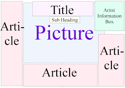
My first layout is fairly simple, the main focus should be the picture so this will be fairly big and in the middle of the page. The title will also be rather big so when the reader turns the page they will see the title and the subheading will explain what the article is about so it will engage the reader. I decided to include a 'Artist infomation box' will will give infomation about the person in my photograph; this will make the reader feel they know the artist better. The article will be written all around the page and picture but it needs to be easy to follow. 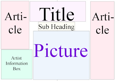
My second layout is fairly similar however the article will only be written on the left and right hand of the page. The title and sub heading will still be a main focus. Also the infomation box will be at the bottom so it isn't as noticable. The picture is also slightly smaller.

My final layout is fairly different. The photograph takes up the whole of a page so it is nice and big. The title is still fairly big but it is on the left hand page. The article is all on one page so it is fairly together and it is easy to follow. Although this layout doesn't include an artist infomation box.

My second layout is fairly similar however the article will only be written on the left and right hand of the page. The title and sub heading will still be a main focus. Also the infomation box will be at the bottom so it isn't as noticable. The picture is also slightly smaller.

My final layout is fairly different. The photograph takes up the whole of a page so it is nice and big. The title is still fairly big but it is on the left hand page. The article is all on one page so it is fairly together and it is easy to follow. Although this layout doesn't include an artist infomation box.
Front Cover Layout
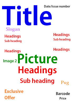
My first front cover is fairly simple, the title is the most important thing as people need to know what magazine it is so that is very large and in the top left hand corner. The date and issue number are also important but they don't need to catch the readers attention, so I put them in the top right hand corner. I put a sloagn under the title to explain what it means. I want the picture to take up the whole page so i put that in the centre and I will have the less important headings on either side of it. Then I will have the main heading that relates to the main photo on top of it in the centre. There will also be a smaller photograph relating to another heading. I will have the exclusive offer lower down but quite big and bright to catch people's attention. The pug will be next to the heading so they will read it after they have read the main heading. Finally I will have the barcode and price in the corner as they aren't important.

My second front cover is fairly similar but I think it is more sophisticated. The differences are: I will have the headings all on one side and the photograph more to the right, then the headings will be placed around the photo to make it look more sophisticated and easy to follow, it will also draw the readers eye to the photo. Also the pug will be at the top, next to the title so its easy to see and the exclusive offer will have a photograph next to it to explain it more.
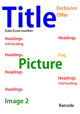
My final is more simplistic; the exclusive offer will be near the top so it is easier to see and encourage people to buy the magazine. The headings will be on both side of the photo to frame it. Also I will have a second image at the bottom so it doesn't clash with the first photo.
I think the laout that I will try to use is the second one as it looks the most sophisticated.
Tuesday, 28 February 2012
Planning Fonts
Planning Fonts
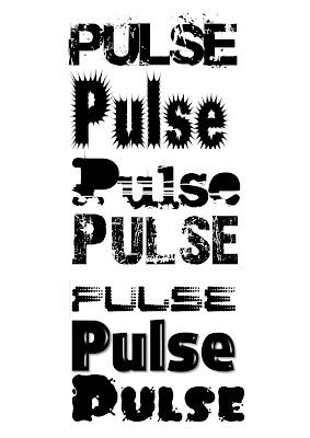 I decided my magazine name is going to be Pulse as it is catchy and memorable, also it is easily related to the music industry. However to make it more suited to the rock genre I decided to use quite an edgy font, so it appeals to my target audience of teenagers. I will also have a sub heading to describe the title; this will be ‘Feel the Music’ as that is what Pulse is about-when music is so loud you can feel it pulsing through your body. I took inspiration FROM Word magazine another rock music magazine) with the subheading as they have a different one every issue, so I also want to do this. I experimented with lots of different fonts to see which was the best, I also asked people’s opinions and considered their answers before I made my finale choice; which was the first design-the font is Base 02.
Monday, 27 February 2012
Dolby
There is some very good reasoning of decisions here- well done. What you could do is possibly think of a strapline or slogan for your mag to put under the Masthead to make the title of the mag clear. Also, you mention using similar photos; although the style of the photos of the artist will be similar, remember that you get marks for using a variety of shot types and distances.
Keep up the good work.
Keep up the good work.
Friday, 24 February 2012
Product Planning
For my planning I am looking and researching the important areas that I need to consider before I start designing my magazine, such as: Names; Colours and Images. These things are important and I will use similar themes for all of them throughout the magazine-like the colour scheme will be used for the whole magazine.
My magazine’s genre is rock so I want my names to clearly represent that, it also needs to be short, catchy, unique and memorable. The ideas I have had so far are: R&R! Rock the Roll! Roll on the rock! Freak out! Revolving Rock and Pulse! These are all very clearly related to both the rock genre and the music industry. For many of them I have based them on the saying Rock and Roll, yet I have altered them slightly so they are memorable, because audiences would relate them to that saying, and they’re catchy. However, Freak Out and Pulse are not so easily related to the rock genre. I like the name pulse because it makes the audience think of loud music ‘pulsing’ through their body which may also remind them of times they have experienced loud music-like clubs or gigs-so they will have a positive felling from the magazine and be more likely to buy it. R&R stands for Rock and Roll which is quite clear, but it is a original way of putting it, also it is short so it will be good on the front cover of a magazine because I can make it stand out (like Q magazine has a very short names). Revolving Rock is an interesting idea because revolving is another way of saying roll, but also rock is like a stone so it could mean both Rock and Roll and Rolling Stones (which is a famous rock and roll band).
Colour schemes are very important because they have to attract the right target audience and reflect the genre, it will be used throughout the magazine in everything from photographs to article titles. The colour schemes I have thought about using are: Red, black and White, Green, black and white, Purple, black and white. Red, black and White are very typical of the rock genre so these would be a good one to reflect the genre, however most rock magazines use this colour scheme so my magazine wouldn’t stand out from the rest. Therefore I want to use the basic colours-black and white (which connotates death, danger, power and purity), but I want to chose a different main colour, so it will stand out from the rest and catch people’s attention. Green and Purple are good because they are both quite sophisticated colours so would attract a wide target audience of different ages and genders. Green connotates: goodness, money, and wealth, which people often relate with the music industry. Purple connotates royalty- which may be suitable as in the music industry artists are often called music royalty or the King/Queen of Rock/Pop.
Next I researched the image on the front cover, I decided I want a photograph of a female, females are often use as it appeals to both men and women; men look at it in a sexual way, whereas women look at is to try and relate to I and imagine themselves as that girl. The girl will be wearing clothes that relate to the colour scheme although you won’t see much of the clothes as it will be a close up or medium shot so you can see her expression. She will be looking directly at the camera to engage the audience. She will also be the individual that the double page spread is about so there will be more photo’s of her. Any other photo’s I use will be in a similar style to the one on the front cover.
Thursday, 23 February 2012
Product Placement
Clearly music magazines are very popular-between January and June 2009, approximately, 582,697 music magazines were sold in the UK alone-and a lot of these sales greatly depend of the actual sale and advertising of the magazine, because after all a magazine won’t sell many copies if it isn’t easily accessible. My target audiences are teenagers around the age 15-19, and it will be a rock magazine as these are a popular type of magazine but there is a gap in to market for one aimed at a younger age group.
The majority of people in my questionnaire said they buy their magazines at local shops so this is where I will mostly sell my magazine, they will be on middle shelves as these tend to sell most and hold the best magazines as this area is in the consumers eye-line and reach, and I want to make it as easy as possible for people to buy my magazine. I will also have them near food as this means when customers pop into local shops to by lunch they may also pick up my magazine if it is nearby.
I will also sell my magazine in supermarkets-such as: Tesco’s, Waitrose, Sainsbury’s and Morrison’s. I think this will sell well because people often spend a lot of money in supermarkets if they are doing a big shop, so they may not worry about spending a little bit more on a magazine. I will sell them near to till as people may pick it up as a last minute thing so they can read it whilst queuing so that will boost my sales.
Another main place I will sell my magazine is in music stores like HMV; this is a good place to sell them as I know that people who go there are fans of music so they are likely to buy a music magazine which is good for me as it will increase my profits.
Possibly in the future I will have an online version-however I feel the magazine would need some credibility before I did this-also it may mean I would lose some profits as some people may be able to read and download my magazine without paying for it. However when my magazine has a reputation I may sell it online anyway as even if I do make a loss from some illegal downloads I will make up for it saving on paper and printing costs.
Tuesday, 21 February 2012
How research will inform my planning
From my analysis and questionnaire I have found out a lot about what type of music magazines people like and what they buy. I will aim for my magazine to both fit a gap in the market but to also appeal to a wide target audience. Form my questionnaire I learnt that the most popular genre’s of music magazine are rock, pop and R ‘n’ B. However the majority of people I asked where within the age range of 16-19 therefore the information is mostly relevant to them so they will be my target audience. Overall I think my magazine will mainly be a rock magazine as this is both a popular genre of music and a popular genre of magazine; also there are many pop and R ‘n’ B magazine already in circuit (such as: Vibe, Blander, Top of the Pops, Billboard etc) so there is a gap in the market for a new rock magazine.
Also from my questionnaire I found out that main reason people buy music magazines is to keep up to date, the next main reason is to find out about new up and coming artists. As a result my magazine will mainly be about current, popular artists but I will also include a lot of ‘exclusive’ information about new artists. Yet they didn’t necessarily say they wanted a new artist on the front cover, they defiantly didn’t want an older artist but instead they want an established artist or band. They also revealed that they would like to see lots of pictures rather than writing which makes sense if I am appealing to a younger age group. As my target audiences are around the ages 16-19, my layout will be fairly simple so it is clear to read and understand, yet on the other hand I will try to have lots of pictures and some different types of layouts that will appeal to my target audience. For example I will have short, catchy title’s that are big and bold; I will do this by using things like alliteration.
From my questionnaire I found out that not many people buy magazines weekly, so as a result I decided to make mine a monthly magazine. Also they said they would be more likely to buy the magazine if there was a special offer on, so I will make sure to include a special offer in my music magazine. From my questionnaire I found that most people would be happy to pay £1-3 for a magazine and some would pay £4-6 so my magazine will sell for £2.20 which is within people’s budget (it has to be quite cheap if I am aiming at a younger audience) and it also leaves room to make a profit. I would like my magazine to be quite professional and high quality so I can’t sell it too cheaply as I want a glossy front cover to make it look better quality and more sophisticated however the rest of the pages needn’t be such high quality. This price will also be competitive with other magazine prices- which tend to be about £5.
From Mrs S
There's some quality work here Megan. One point though, I agree with Miss D that the order of the posting is a bit confusing - minor quibble as I can't fault the quality of what you've done.
Monday, 20 February 2012
Q Magazine Contents Page
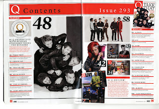 Q magazine contents page:
At the top of this contents page is a big red bar – which fits the house style of red, black and white. These colours are very simple but also bold; they are also related to the rock genre as red connotates passion; and black connotates darkness and danger however white connotates purity which balances them all out. In this bar, on the left hand side is the Q logo that was on the fron cover, although it is uch smaller-this is used throughout the magazine so on every page the reader is reminded of what magazine they are reading. Then they have “Contents” so it is clear what the page is for and if the reader wants to find a certain article they can go to the contents page which they know will be at the front. Then on the right hand side it says “Issue 293” this shows the reader that there have been lots of issues so it must be a well established magazine. All the writing in this bar is very big with a simple font so it is easy to read. Next to this is a photograph of the front cover-this is so the reader can relate the issue number to the actual issue.
Underneath this on the left hand side is another red bar-although this one is much smaller-which says “FEATURES” It is in block capitals and again a simple font so it is easy to read, and it is white so it stands out against the red bar. It makes it clear that below it is listing all the feature articles and what page they are on. Below this is a picture of a Q shaped trophy saying award winners-this relates to the writing below which says that the article about the Q award winners are on page 47. Then is red it has a short description of what the article is about. This is clearly a very important article because t is slightly different to the others. It still has the page number then a little line and he article title however the writing is bigger than the others. Also it has a long title whereas the other articles are summed p in one or two words. Also the description is in red whereas it is black for the others but they are divided by red lines, this is divided by a black line. This happens again in the same format with the review on page 99; this is shown in the bottom right corner, so these were clearly chosen by the magazine as the most important articles.
On the left hand side of the second page are the “REGULARS” they are written in the same style as the features with the age number, title and description. All the writing is aligned to the left; however the bars under each page number create the equal column size. Not every page is mentioned in the contents page but all the important articles are divided into regulars and features and then put in number order again so it is easier to follow. At the bottom of the page is a big black line to show that it is finished, the only things underneath this are the information that is placed on the same page in every page-the Q logo, the page number and date.
Finally in the middle of the page are photographs which are related to the articles. There are seven photographs altogether. For example the biggest photograph is of take that with each photograph is a large number which tells the reader which page is the article-which is related to that picture- is on.
Word magazine double page spread
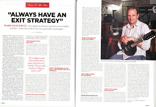 Word magazine double page spread analysis:
 The Word magazine double page spread sticks with the same colour scheme as in the front cover and the contents page; these colours are red, black and white. These colours are very simple but also bold; they are also related to the rock genre as red connotates passion, blood and sex; and black connotates darkness and danger however white connotates purity which balances them all out. The whole layout of this double page is very clear and easy to follow.
At the top of the page is a thin black line, which is used throughout Word magazine to separate different articles, so this line shows us that this is a new section-there are also lines separating each column and at the end of the text so it is very clear to read. In the middle of this line is a red box (fits with the colour scheme) with “Word To The Wise” written inside it. This is important because it partially explains what the article will be about but it also begins with “Word” which is the title of the magazine so it will remind readers of the magazine they are reading and they will then relate that article to this magazine. Also it suggests that in this article the writer is giving the reader useful advice. The font for this writing is Handscript SF which is very elegant and sophisticated-this tells the reader that it isn’t like advice from other magazines as they tend to be for younger audiences however the target audience for Word magazine is older and more refined.
Underneath this is the main title of this article-“ALWAYS HAVE AN EXIT STRATEGY” this is in the centre of the page in big bold black writing so it is clear to see. It stands out in the page so the reader knows that this is the title of the article-it is also a quote from the article so it engages the reader and makes them want to read on. It is a plain font (possible Arial Bold) as it doesn’t need to be fussy it just needs to stand out as they want you to read the words rather than the font also because of tis reason it is all in block capitals.
Below the title is “Mark Radcliffe” this is again clear and bold but it isn’t quite as big because it isn’t so important, however it is quite important information that the reader needs to know so it is red to catch the reader’s eye. Then there is a sort description of him as if the reader knows who wrote the article they are more likely to engage and enjoy the article. For this reason also in the top right hand corner there is a large picture of Radcliffe. This takes up about 1/3 of the page so the reader cannot miss it. In the picture it shows him holding a guitar-this relates him to the rock genre of the magazine. In the background is a sign for BBC Radio so the reader relates him to this and knows what he does even if they didn’t read the description.
Back to the beginning of the article, under Radcliffe’s description is “Interview by Mark Ellen” however this is very small so if somebody wants to know who has written it they can find out, but if they aren’t looking for it, it will not necessarily catch their eye. Finally underneath this it goes on to the actual article. There are three columns on each page which are separated by thin lines. There are seven paragraph titles’s which are in bold and red-these are also quotes from the text and encourage the reader to read on. The font of the text is very simple as it has to be clear to read and not be too fussy. There is also a pull quote in the middle of the first page-this will probably be read by the reader before they start reading the article so must engage them-this is also in red to catch the reader’s eye. Finally at the bottom of the page is the page number and name of the magazine which is used throughout Word so the reader know what they are reading and can easily find things.
Miss D
A detailed analysis here. Just consider how the contents shows a 'house style' and key info that needs to be included such as page numbers, date, name of mag, web address and where these are placed.
Friday, 10 February 2012
The Word Contents Page
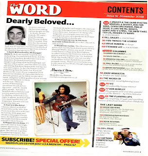 The Word Contents Page:
The contents page of Word magazine has a bright red mast head which says the name of the magazine, that it is a contents page, the issue number and the date. On the front cover the title-The Word- is in bold with a white outline and red on the inside, however on this page it is smaller so it doesn’t need to be so detailed; the masthead background is red-this relates it to the original display but the whiting is pure white. This makes it easier to read because as it is smaller, if it was to detailed then it may look cluttered and jumbled but it still uses the same font and layout as that is classic to Word magazine and the audience would relate that layout to the magazine. The word ‘Contents’ is in block capitals and also a fairly basic font so it is easy and clear to read.
It is in black, this means he top of the page uses the colours: black, red and white-which is the colour scheme of the magazine as the connotates rock and roll which is the magazines genre. The issue number and date are in a much smaller font size as they are not that important, and also another font for that matter. The font is far more elegant and far less ‘in your face’ in addition they are in white so they seem softer and easier to read against the red background. There is a line between the issue number, date and the word ‘Contents’ this separates the important information and the extra information.
Underneath this is details on what articles are in the magazine and on what page they are on, that is on the right hand side of the page. Then on the other side of the page is a letter from the editor. The letter from the editor takes up most of the page as it is interesting and lots of people want to read it, however the contents is normally only looked at when people want to find a certain page. The first line of the editor’s letter –“Dearly beloved…” is n very big font, this is because it makes it clear that it is a letter as it is a standard opening line of a letter. The font is the same as the headings of articles on the front cover; this would be a similarity throughout the magazine. Next, is a photo of the editor (Mark Ellen) this makes the letter more personal because the audience can see what he looks like and know who wrote the letter. The photo is in black and white so it fits in with the colour scheme, in addition it makes him seem more friendly and down to earth because it would remind the audience of an old family photo.
In the letter Ellen makes 5 main points so these are numbered and in bold so it makes it clear what he is saying, it also means that if you don’t want to read the whole latter you can just read the main points and understand what he is trying to say. Finally at the end of the letter he has signed it-which again makes it seem more personal, then his email address is underneath it, this makes readers feel that they can contact him and he is interested in their opinions. The email address is also at the bottom of the page, along with the date and page number; these are on most pages of the magazine. Also at the bottom of the page is a bright yellow pug, s it is very eye catching. This pug is encouraging people to subscribe to the magazine-which is what the magazine want you to do as their main purpose is to sell magazines. It offers a free CD and a lower price per issue to attract people to subscribing.
Then the page is divided by a thick black line, to make it clear that part is something completely different. Then there are the main article headings with the page number next to it, this is in red to make it stand out so the reader doesn’t have to go searching for it. Also in red are signs which say which are the articles that were mentioned on the front cover-as these are usually the articles the audience most want to read. In beige coloured boxes are the articles that are regular features-as often people who buy the magazine every week will like that they are always there and want to read them.
There are two of these boxes – the ‘Word columns’ and the ‘Last Word’-which is a play on the magazines title. At the bottom of this column is a comical cartoon of some previous monarchs this will interest readers and make them want to know which article they are related to.
There is also a old photograph of Bob Marley as there is an article about him, this means that even if people don’t read the contents page, if they just glance at it they will still know that there is an article about him in the magazine.
Wednesday, 8 February 2012
Tuesday, 7 February 2012
Questionnaire Analysis
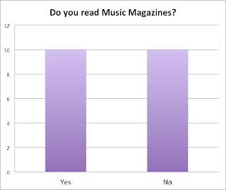
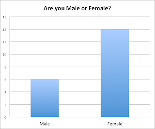
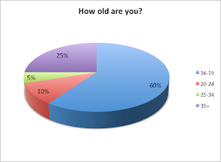
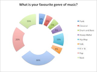
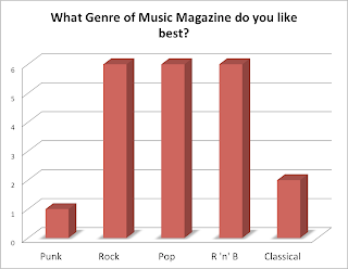
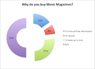

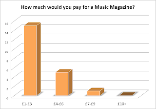
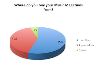
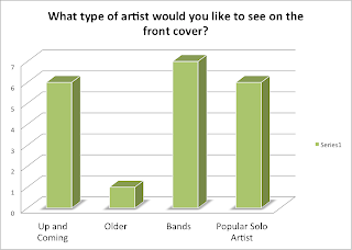
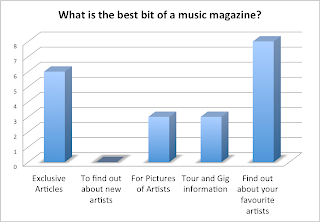
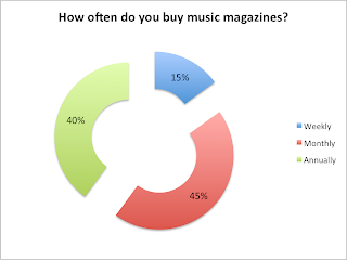

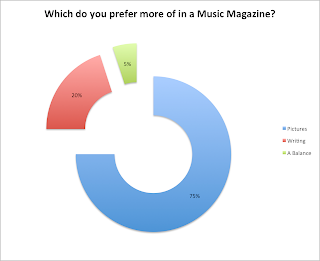
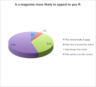

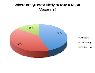
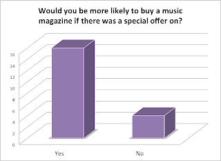
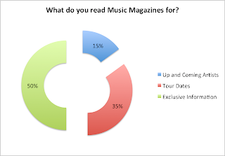
This is an analysis of the music magazine questionnaire I handed out.
Half of the people I asked do buy music magazines, and half don't.
I asked more females to answer my questionnaire.
The majority of the people I asked to fill out my questionnaire were between the ages of 16-19, which will most likely be the age of my target audience.
It is clear most people want to find out about their favourite artists or read exclusive interviews, nobody wanted to find out about new artists.
Most people would be more likely to buy a music magazine if there was a special offer on, so I will include a special offer in my magazine.
Not many people buy music magazines weekly, so I will make mine an monthly magazine.
People said they would like to see bands, popular solo artists or up and coming artists on the front cover, not many wanted older artists on the front.
Most people buy their music magazines from local shops.
It is clear from this that people don't want to pay much for a music magazine, so the most i would price it at would be £5.
Most people buy music magazines to keep up to date, so I will include lots of infomation about newer artists rather than older ones.
Punk and classical aren't very popular but, rock, pop and R 'n' B are.
R 'n' B and pop are clearly the most popular genre's of music.
Most people want to see pictures in a music magazine rather than writing.
Most people want exclusive information.
Most people said it would appeal to them if the artist was in the charts, so I will use popular, up to date artists.
Subscribe to:
Comments (Atom)


